About Filtergraph
Filtergraph is an interactive online tool for visualizing large datasets. While it is originally designed to meet the needs of astronomers in a wide variety of projects, Filtergraph can be used to manage data in any situation where large-scale data visualization is needed, including academic research and data-driven journalism.
It's simple to start exploring your data with Filtergraph:
-
Create an account on http://filtergraph.com
-
Create a portal that will host your data. All portals are given an easy to remember URL for you and others to access later.
-
Upload one or more files to your portal. We accept many types of files, including ASCII and Microsoft Excel.
-
Use your portal to explore your data, building graphs and tables along the way.
-
Share your portal, and the graphs and tables you build, with others. Not only will they be able to view your results, they can interact with the data from within the portal you built.
-
If you wish, you can customize your portal and control who can view and edit your data.
We originally developed Filtergraph in early 2011 for our own purposes as a dashboard for the KELT South telescope. At the time we needed an interactive tool that would quickly run through a catalog of over 100,000 rows and produce scatter plots out of two or more columns on the fly. As other people have expressed interest in our project, we have worked hard to add new features and expand its use. We opened Filtergraph for user registration in 2012 and today we have over 1,000 registered users from around the world.
In March 2015, we launched a new version of the Filtergraph site. Along with a revamped look, the new version has the ability to produce new types of graphs and save existing graphs to a notebook.
Filtergraph is now a part of the Frist Center for Autism and Innovation. It turns out that many autistic people have the ability to understand patterns in images at a superior level, such as the images that may appear in a scatter plot of Filtergraph. If we can develop the tests to identify those people, we can set them up for long-term employment doing similar tasks. Also, by exhibiting Filtergraph at the FCAI office in Vanderbilt's new Innovation Pavilion, we hope to inspire autistic children and young adults into similar career paths.
This page gives an overview of Filtergraph and its features. For a more technical discussion of Filtergraph, please see our paper in Astronomy and Computing or the Arxiv version of our article.
Setting Up a Portal
With Filtergraph, you can create your first portal and start exploring your data in minutes.
Creating an Account
To create an account on Filtergraph, simply go to filtergraph.com and click on the “Create an account” link underneath the Login form in the top right corner of the page.
The form will ask for your name, your email address and a password you would like to use to access your portal management page. Registering for an account means that you agree with Filtergraph’s Terms of Use & Privacy Policy. Once your account is created, you can begin importing datasets and creating portals.
Uploading Datasets
To start importing dataset files, just click on the “Create a new portal” button that is present on the page displayed after you successfully register/login.
Whatever name you give the portal will automatically become the end of its URL, but you change this by simply editing the ending in the text box. These can be changed later.
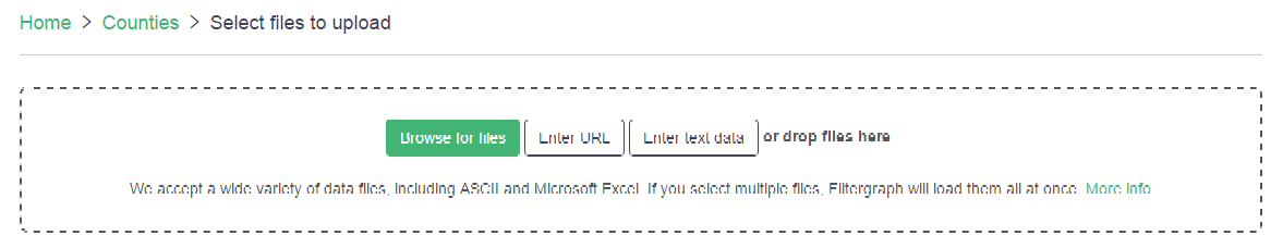
When you create a new portal, you will then be able to upload data files into the portal through the upload file dialog. There are four methods for uploading data files. The first method is to browse for files that are saved in your computer. The second method is to enter the URL of the data file. The third method is to manually enter the data, or copy and paste the data, into the textbox provided by Filtergraph. The fourth method is to directly drag and drop the data file into the upload file dialog area.
Once you upload a data file, the upload file dialog will display the number of rows and columns in your data file, and show the first five rows. If this information is correct, you may press the finish button to confirm the uploaded data file and proceed to visualize the data in the portal.
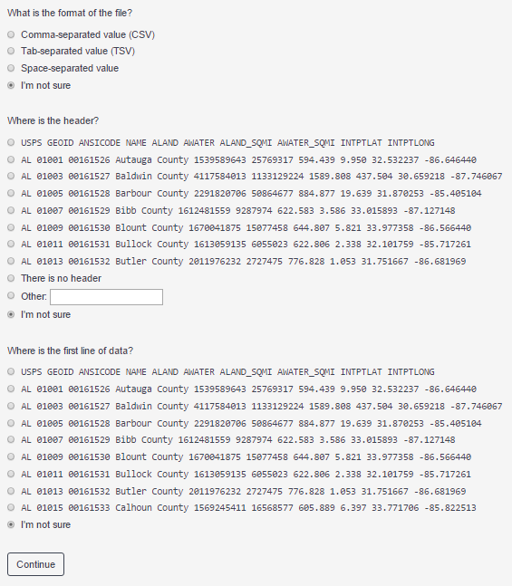
However, if this information is wrong, you may press the undo button to delete the file. Otherwise, you may press the import settings button to clarify to Filtergraph the format and settings of the file that you uploaded. Specifically, Filtergraph will ask you to identify the format of the file, the header of the file, and the first line of the file. Once you provide this information, Filtergraph will then redisplay the dimensions and first five rows of the data file, taking into account the information that you provided. If the import settings options do not make the data look right, then it is recommended that you try saving the file in a different format.
Supported File Types
Filtergraph will allow you to upload dataset files in the following formats.
| ASCII text | Tab, comma and space separated |
| Microsoft Excel | *.xls, *.xlsx |
| SQLite | *.sqlite |
| VOTable | *.vot, *.xml |
| FITS | *.fits |
| IPAC | *.tbl |
| Numpy | *.npy |
| HDF5 | *.h5 |
You can upload files up to 1000MB in size. Larger files can be accommodated if you contact us via a feedback form.
For best results:
-
Make sure each row has the same number of columns. If a row has an incorrect number of columns, it will be ignored.
-
Place a header in the first row to name each column. If a header cannot be found, the column names will be assigned as Column1, Column2, etc.
-
If you include a header, make the name of each column unique. Otherwise, the duplicate names will be modified.
-
For ASCII files, you may optionally use the '#' symbol to designate a header.
Accessing your Portal
Once a portal has been created, you will always be able to access it from your dashboard after you login.
A portal may also be accessed outside of login using its unique URL (defaults to filtergraph.com/nameofportal). More ways to return to a portal are discussed here.
Using a Portal
Filtergraph portals are a simple yet powerful interface for you to visualize and explore your data.
Labeling and Displays
Filtergraph defaults to a scatter plot mode of displaying data, with the X-axis, Y-axis, and color parameters set to default values.
The X-axis, Y-axis and Color default values are specified either by you during outside-of-portal customization or by Filtergraph as the first 3 columns in your dataset. These, along with the Size and Z-axis, may be changed by simply selecting a column from your dataset from the drop-drown menu that appears when you click in an axis box.
Scatter plot mode hosts the most customization opportunities, and these customizations will be carried over to the histogram mode. The axes dimensions can be changed, thus changing the graph’s display, by clicking on the blue filter to the right of each individual axis box. Filtergraph also allows an automatic adjustment of the X- and Y-axis when no Z-axis is designated in the form of a click-and-drag zoom feature. This is discussed in more detail in “Scatter Plot”.
Filtergraph automatically names each axis after the column of data it refers to. These names may be changed by clicking the “more…” button in the bottom right of the settings box and entering a new name in the label box beneath each axis.
You can change the color palette used to highlight your datapoints underneath the Color section of the settings box. This is discussed in more detail in “Color Palettes”.
At the bottom of the settings box is a box to add a title to your graph, change point and font size and point type. The “Swap black and white” checkbox, which gives the graph a black background and white text, is also located here.
Histogram mode maintains the title and axes customizations made in scatter plot mode. Number of bins may also be changed from the default of 100 here.
Table mode allows sorting by a designated column. You may also change the number of displayed rows; the significance of row number is covered in “Saving and Sharing”.
Choosing a Dataset
If you uploaded more than one dataset file to your portal, then you may click on which set of data you would like to work with at the top left of the portal.
Switching between datasets will erase all edits to the other dataset’s graphs.
If you only uploaded one dataset file to your portal, then that data is what you will be working with within the portal.
Undo and Redo
The undo and redo buttons are located in the upper right corner of each portal.
If you would like to undo your most recent action, simply press the undo button. If you would like to redo an action that you had previously undone, simply press the redo button. Each button may also be pressed several times to undo or redo a series of actions. Hovering over either button generates a description of the action that will be yielded by pressing the button.
Filtering and Highlighting
Filtering and highlighting allow you to work with certain segments of the data, or to compare a segment with the data as a whole.
- Filtering
-
You can filter out specific parameters by clicking on “Filter” just below the dataset descriptions. This will bring up boxes for setting a variable, filter type, and values for comparing the variable. You can select a column from the dataset using the automatically generated drop-down menu that appears when the variable box is clicked on. For more information on what else may be entered into this box, see “Mathematical Functions”.
This function is different from adjusting the axes dimensions in that it will remove all datapoints with parameters outside of the designated range from the entire graph. This is extremely effective for removing outliers or irrelevant datapoints.
The filtering function in Filtergraph allows you to display selected data points based on certain criteria.
-
Is between: Displays data that is between a specified maximum value and minimum value.
-
Isn’t between: Displays data that is not between a specified maximum and minimum value.
-
Is equal to: Displays data that is equal to the specified values.
-
Isn’t equal to: Displays data that is not equal to the specified values.
-
Is between: Displays data that is contained in the specified list of values.
-
Isn’t between: Displays data that is not contained in the specified list of values. Note that the list is delimited by the enter key.
-
Between percentiles: Displays data that is between the specified minimum and maximum percentiles of the data.
-
Outside percentiles: Displays data that is not between the specified minimum and maximum percentiles of the data.
-
Starts with: Displays data that starts with the specified letter or word.
-
Ends with: Displays data that ends with the specified letter or word.
-
Contains: Displays data that contains the specified letter or word. Note that these three filters are for non-numeric data values only.
-
Is in lasso, isn’t in lasso: The "is in lasso" and "isn't in lasso" criteria need to be used with a preexisting lasso. Filtering by the "is in lasso" criteria will display data that is contained within the lasso. Filtering by the "isn't in lasso" criteria will display data that is not contained within the lasso.
-
- Highlighting
-
The Highlight button is located in the upper left corner of each portal next to the Filter button.
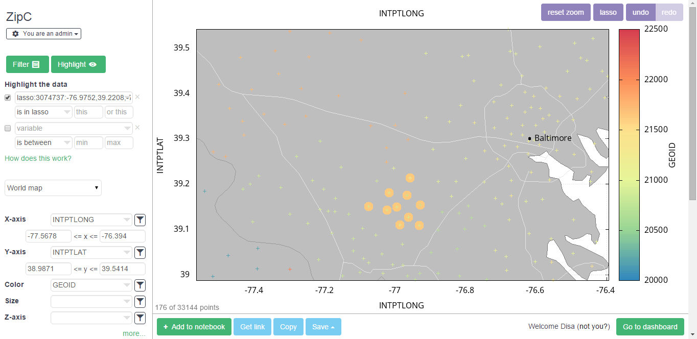
The highlight function allows you to define criteria in order to highlight a specified portion of the data. It is often helpful to highlight a set of points in one graph and then track these saved points as the graph is changed. This helps to see the same points in different parameter spaces.
When a data point is highlighted, it will be surrounded by a light-orange circle. Data points may also be selected for highlighting with the lasso tool; please see the "Lasso" help section.
The highlight function works differently for different types of graphs.
-
For scatter plots, world maps, line charts, and error bars, a highlighted data point will be surrounded by a light-orange circle.
-
For the histogram, a histogram of all of the highlighted data points will be displayed on top of a histogram of all of the data points.
-
For the table, all of the rows associated with the highlighted data points will be shaded in orange.
-
For scatter plots, world maps, line charts, error bars, and histograms, a highlighted point will be given priority over a non-highlighted point when you click on an area with data points requesting information on a specific data point.
-
For all other graph options, the highlighting function has no effect.
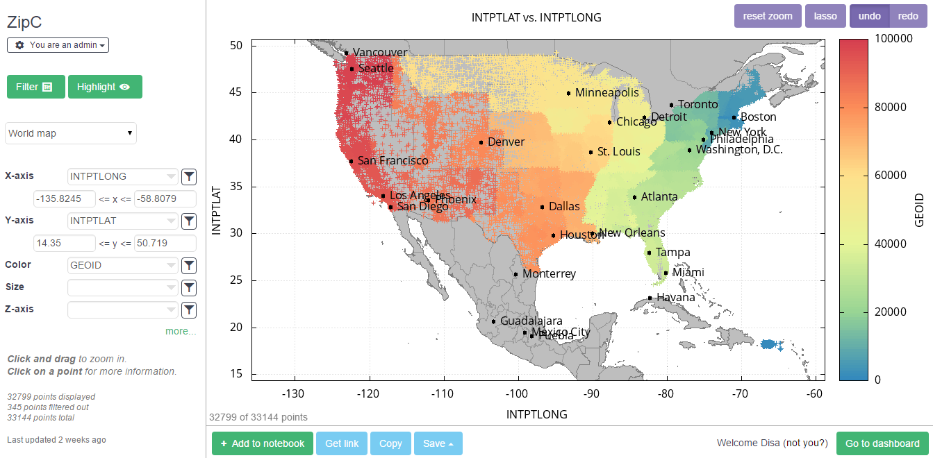
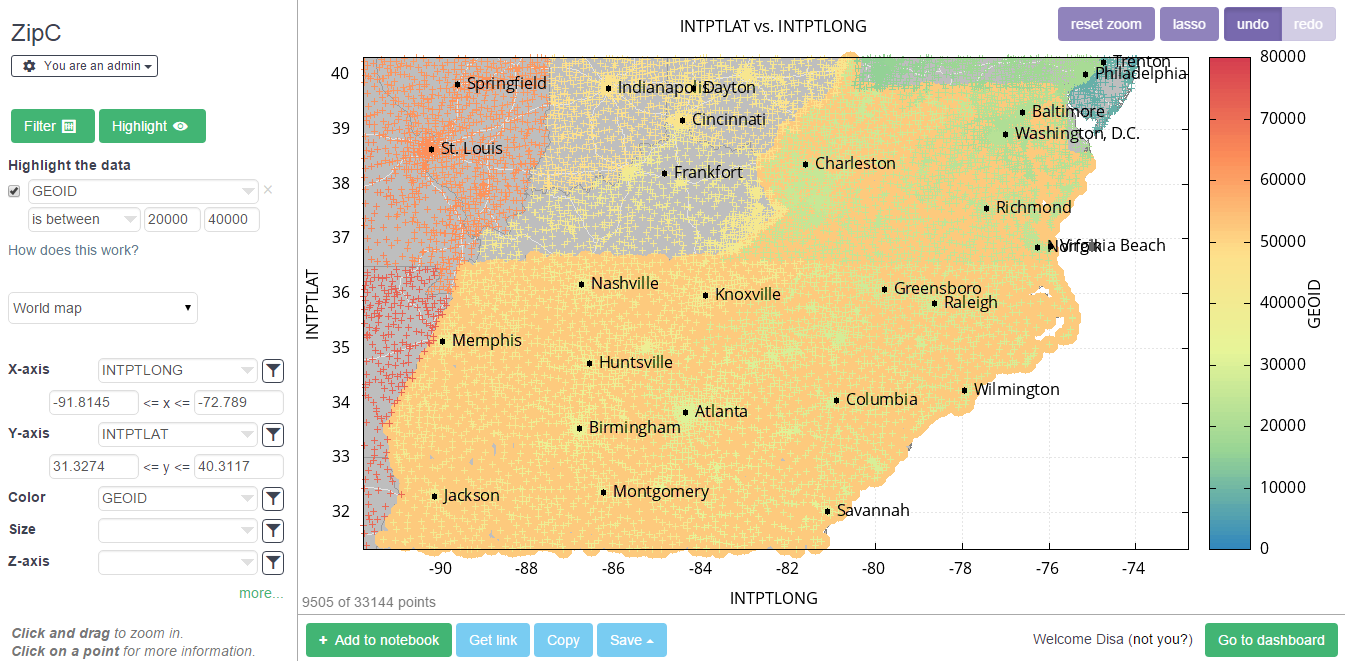
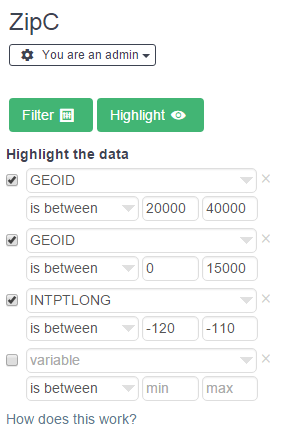
To highlight a portion of the data, first choose the data variable to consider for highlighting from the drop-down menu. Then, indicate the criteria with which to highlight the data in the chosen data variable, from the options below. For example, the data variable "GEOID" which represents the zip code number has been chosen for highlighting, and the specific data points in "GEOID" that are between 20,000 and 40,000 have been highlighted.
Each highlight in the highlighting section is related by an AND relationship rather than an OR relationship. For example if a highlight indicates that "GEOID" between 20,000 and 40,000 is to be highlighted, and another highlight indicates that "GEOID" between 0 and 15,000 is to be highlighted, then no data points will be highlighted, since no data point is between both of those ranges.
In order to un-highlight the data, just un-check the box located to the left of the relevant variable drop-down menu. A highlight may be deleted by pressing the "x" symbol located to the right of the relevant variable drop-down menu.
-
Interactive Mode
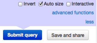
By default, the portal submits your settings as soon as they are changed.
Unchecking “Interactive” causes the portal to only submit your settings once you click the “Submit query” button that appears at the bottom of the page next to the “Save and share” button.
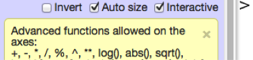
Mathematical Functions
Mathematical operations may be performed on the dataset columns within the axis, filter, error bar and function input boxes.
These operations are supported by Filtergraph:
| + | - | * | / | % | ^ | ** | --- |
| log() | abs() | sqrt() | log10() | exp() | pi | floor() | ceil() |
| sin() | cos() | tan() | sinh() | cosh() | tanh() | --- | --- |
| asin() | acos() | atan() | asinh() | acosh() | atanh() | --- | --- |
| min() | max() | median() | mean() | std() | var() | --- | --- |
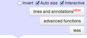
This list can also be found by clicking on “advanced functions” at the bottom of the portal controls box. Examples are “1000/Plx” or “VT+5+5*log10(Plx/1000)”.
Scatter Plot, World Map, Line Chart, and Error Bars
The scatter plot, world map, line chart and error bars work in similar ways and have much of the same features.
-
Scatter plots use the X-axis and Y-axis to plot points on a graph. Additional axes can be specified for color, size, or Z-axis. When a Z-axis is specified, the graph is viewed in three dimensions.
-
World maps use the X-axis for longitude and Y-axis for latitude. If there are columns in the graph for latitude or longitude, they are automatically chosen. Additional axes can be specified for color or size. All points are displayed on top of a world map with country borders, cities, and major roadways. In addition, states and provinces are shown for US, Canada, Mexico, Brazil, France, Germany, Poland, UK, India, China, Russia, and Australia.
-
Line charts use the X-axis and Y-axis to plot points on a graph, with lines drawn between each point. The order in which lines are drawn depend on the order that they appear in the original dataset. An additional axis can be supplied for the Z-axis, which would view the graph in three dimensions.
-
Error bars use the X-axis and Y-axis to plot points on a graph. When either the X error axis or Y error axis is supplied, the points turn into error bars. An additional axis can be supplied for color.
- Axes
-
The axes may be changed by simply selecting a column from the dataset using the automatically generated drop-down menu that appears when an axis box is clicked on. For more information on what else may be entered into axes boxes, see “Mathematical Functions”.
Axes dimensions may be changed using the blue filter button located to the right of each axis box. Clicking on the button will reveal boxes to input a range for the given axis. Only entering a value into one box will result in the graph displaying points between the value and the auto-sized limit defaulted to include all points on that end of the number line.
An axis may be changed to a logarithmic scale (1, 10, 100, etc.) by checking the “log” box underneath the axis box.
The axis may also be reversed by simply checking the “reverse” box underneath the axis box.
An axis may be renamed by typing the desired title in the “label” box.
The Z angle parameter is discussed in “Rotation”.
- Color Palettes
-
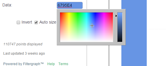
Different color schemes may be chosen in order to visually customize your portal. The color scheme can be changed by clicking on the selection box next to Palette underneath the Color section of the blue editing box. The color scale can be gradated (e.g. Rainbow, Earthy, Pink and Green), distinctly separated into up to 9 different solid colors (e.g. Two Colors, Three Colors, Four Colors), distinctly separated into different dark and light pairs of up to five colors (e.g. Two Pairs, Three Pairs, Four Pairs) or distinctly separated into up to five different gradated solid colors (e.g. Two Scales, Three Scales, Four Scales).
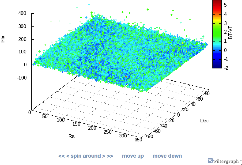
- Rotation
-
When a Z-axis is added to the scatter plot, Filtergraph will switch to a 3-dimensional display. Rotation on the graph may be performed by either entering degree values into the Z angle box under the Z-axis or by using the “spin around,” “move up,” and “move down” controls displayed underneath the graph.
The first entry box corresponds to vertical angle and is increased/decreased by increments of 10 degrees when “move down”/”move up” is clicked.
The second entry box corresponds to rotation of the X-Y plane horizontally. The small left/right arrows decrease/increase in increments of 10 degrees, while the double left/right arrows decrease/increase in increments of 50 degrees.
- Zoom
-
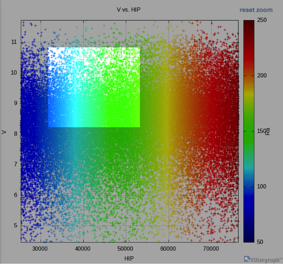
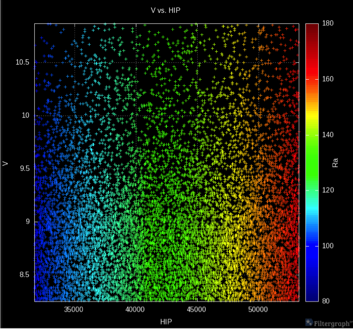
A convenient and quick way to change the dimensions of the display window to focus on a certain portion of your graph is to use Filtergraph’s click-and-drag zoom feature. Clicking and dragging on the portion you want to view will automatically resize the window to match both the X- and Y-axis ranges selected. This may be done multiple times, but only to zoom in. In order to zoom back out to the original window size, just click the “reset zoom” button displayed above the color axis.
- Point and Click
-
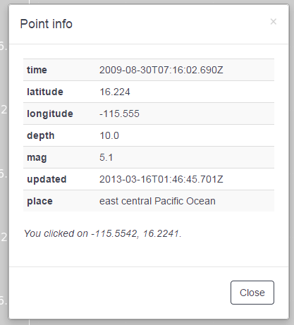
While in scatter plot mode, you may click on any point on the graph to immediately see every column of data for that specific point. This function is not available when the Z-axis is set to anything other than "none".
- Error Bars
-
Error bars may be added to a graph by setting the graph mode to "Error bars". This will reveal boxes for X and Y error that may be linked to columns in your dataset. For more information on what else may be entered into these boxes, see “Mathematical Functions”. These can be given ranges just like the axes by clicking the filters to the right of the input boxes. The error bar function may only be used when there is no Z-axis and removes any Size specification.
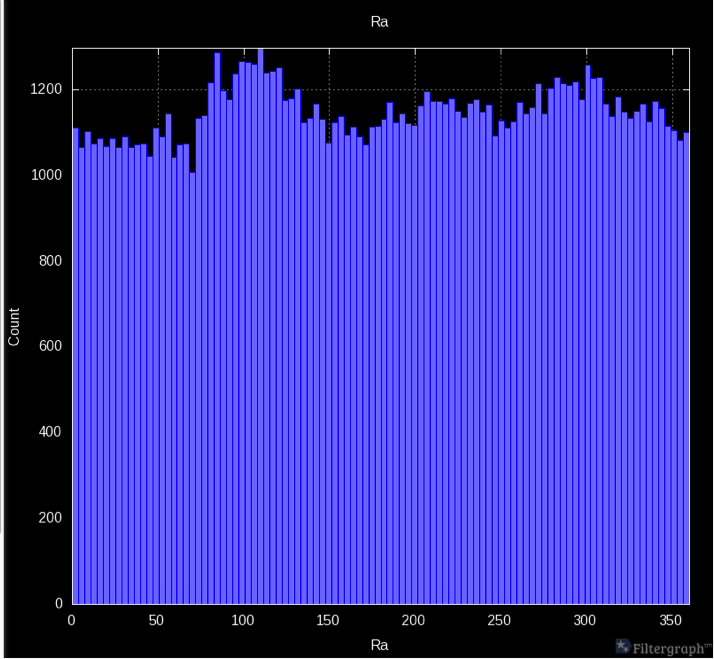
- Swap Black and White
-
The swap black and white function gives the graph a black background and white text. This can make points on the graph easier to distinguish from the background. The “Swap black and white” box is located below the text formatting section of the portal controls.
- Auto Size
-
The “Auto size” box is located at the bottom of the portal controls box. Auto size automatically resizes the graph window to fit the browser. If auto size is unchecked, you can set the height and width manually.
- Lasso
-
The lasso tool is located in the upper right corner of each portal next to the undo and redo buttons.
Highlighting points and additional points with the Lasso tool
The lasso tool allows you to highlight data points, which will remain highlighted when the settings of the visualization are changed. For instance, the data points will remain highlighted when the type of graph is changed, the axes are changed, or the data filters are changed.
The lasso tool is only available in scatter plot, world map, line chart, and error bars.
In order to highlight data points, either click on the data points individually or draw a circle around the set of data points that you would like to highlight.
When the lasso tool is used to highlight data points, a highlight will automatically appear within the highlight section, in the upper left area of the portal. In order to un-lasso the data points, just un-check the box to the left of the lasso highlight or delete the lasso highlight.
The "Lasso to highlight more..." option lets you highlight more data points with the lasso tool. With each additional set of lassoed data points, an additional highlight will appear in the highlight section of the portal.
Filtering points with the Lasso tool
The lasso tool can also be used to filter points, which will remain filtered when the settings of the visualization are changed. When the lasso tool is used to filter data points, only the data points that are selected by the lasso tool will be displayed on the graph.
In order to use the lasso tool to filter data points, either click on the data points individually or draw a circle around the set of data points that you would like to filter.
When the lasso tool is used to filter data points, a filter will automatically appear within the filter section in the upper left area of the portal. In order to un-filter the lassoed data points, either press the undo button, uncheck the box to the left of the lasso filter, or delete the lasso filter.
Excluding points and additional points with the Lasso tool
The lasso tool can be used to exclude points, which will remain excluded when the settings of the visualization are changed. When the lasso tool is used to exclude data points, the lassoed data points will be excluded from the graph.
In order to use the lasso tool to exclude data points, either click on the data points individually or draw a circle around the set of data points that you would like to exclude.
When the lasso tool is used to exclude data points, a filter will automatically appear within the filter section in the upper left area of the portal. In order to un-exclude the lassoed data points, either press the undo button, uncheck the box to the left of the lasso filter, or delete the lasso filter.
The "Lasso to exclude more..." option lets you exclude more data points with the lasso tool. With each additional set of lassoed data points, an additional filter will appear in the filter section of the portal.
Coloring points with the Lasso tool
The lasso tool can be used to color points, which will remain colored when the settings of the visualization are changed. When the lasso tool is used to color data points, the lassoed data points will be set to a value of "1" while the data points outside of the lasso will be set to a value of "0", and the color will be allocated accordingly.
In order to use the lasso tool to color the data points, either click on the data points individually or draw a circle around the set of data points that you would like to color.
In order to un-color the lassoed data points, just press the undo button.
- Lines and Annotations
-
Text, lines, arrows and functions can be added to the portal display by clicking on the “lines and annotations” button at the bottom of the portal controls box.

-
Text: Selecting “Text” from the Type list allows you to place a string of text on the graph. The position of the text is set by entering the X and Y coordinates of where you would like the text to begin. The size, color and angle can also be set. You may either enter a hex color code or select a color from the palette that appears when the Color box is selected.
-
Line: Selecting “Line” from the Type list allows you to place a straight line on the graph. The start and end points of the line may be set by entering the X and Y coordinates. The size and color can also be set. You may either enter a hex color code or select a color from the palette that appears when the Color box is selected.
-
Arrow: Selecting “Arrow” from the Type list allows you to place an arrow on the graph. The start and end points of the arrow may be set by entering the X and Y coordinates. The size and color can also be set. You may either enter a hex color code or select a color from the palette that appears when the Color box is selected.
-
Function: Selecting “Function” from the Type list allows you to place a function on the graph. The line, curve, etc. will be placed in the portal along with your data points. Whatever the range of your dataset, the function feature will always treat (0, 0) as the origin. The size and color can also be set. You may either enter a hex color code or select a color from the palette that appears when the Color box is selected. You may also label your function. Any text entered in the Label box will appear in the upper right-hand corner of the portal next to a line of the same size and color as its corresponding function. For more information on what else may entered into the Function box, see “Mathematical Functions”. Note that statistical functions (min, max, median, mean, std, and var) may not be used in this field.
-
Trendline: Selecting “Trendline” from the Type list will perform a linear regression on the data and use the resulting line as the function. As with the function type, the size and color can also be set. You may either enter a hex color code or select a color from the palette that appears when the Color box is selected. You may also label your trendline. Any text entered in the Label box will appear in the upper right-hand corner of the portal next to a line of the same size and color as its corresponding function.
More than one of any of the above features may be added to a portal by clicking on the “Add” button at the bottom of the lines and annotations box. Clicking the x in the upper right corner of the box will only hide the annotation settings; clicking the “Remove” button will permanently remove an annotation from the graph.
Any lines and annotations are preserved in the 3-dimensional display.
-
Histogram, Heatmap, and Surface Map
The histogram, heatmap, and surface map types work in similar ways and have much of the same features.
-
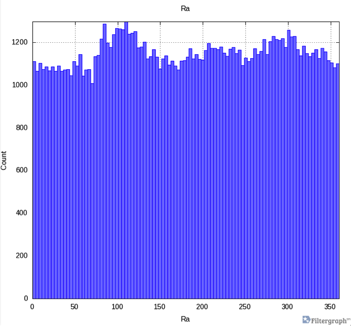
Histograms use the X-axis to segment the rows into bins. By default the Y-axis is set to the number of rows that fit within that bin; it can also be set to the average or sum of a variable among rows that fit within the bin.
-
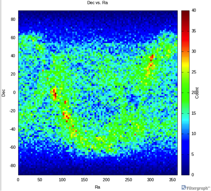
Heatmaps use the X-axis and Y-axis to segment the rows into bins. By default the color is set to the number of rows that fit within that bin; it can also be set to the average or sum of a variable among rows that fit within the bin.
-
Surface maps use the X-axis and Y-axis to segment the rows into bins. By default the color and Z-axis are set to the number of rows that fit within that bin; they can also be set independently to the average or sum of a variable among rows that fit within the bin. Surface maps are viewed in three dimensions.
In previous versions of Filtergraph, the histogram, heatmap and surface map modes were referred to as 1-D, 2-D and 3-D histograms, respectively.
- Heatmap
-
In this mode, both the X- and Y-axis are linked to columns in the dataset, while color indicates bin count.
In the histogram, the Y-axis becomes bin count, while the X-axis is conserved.
- Axes
-
The axes may be changed by simply selecting a column from the dataset using the automatically generated drop-down menu that appears when an axis box is clicked on. For more information on what else may be entered into axes boxes, see “Mathematical Functions”.
Axes dimensions may be changed using the blue filter button located to the right of each axis box. Clicking on the button will reveal boxes to input a range for the given axis. Only entering a value into one box will result in the graph displaying points between the value and the auto-sized limit defaulted to include all points on that end of the number line.
An axis may be changed to a logarithmic scale (1, 10, 100, etc.) by checking the “log” box underneath the axis box.
The axis may also be reversed by simply checking the “reverse” box underneath the axis box.
An axis may be renamed by typing the desired title in the “label” box.
- Bin Statistics
-
The bins in the Histogram graph may be customized according to the desired bin statistics. For a 1-D histogram, the Y-axis may be changed from Count to Average of a Variable or Sum of a Variable. Selecting an option other than Count will reveal a new box so that the variable you wish to perform the operation on can be selected. For a 2-D histogram, operations may be performed on a variable through the Color axis. For a 3-D histogram, operations may be performed on a variable through both the Color and the Z-axis. Count will represent the number of datapoints in a particular range of values for a dataset parameter. Average of a Variable will display the average of the selected variable for each X-axis parameter value range. Sum of a Variable will display the sum of the selected variable values for each X-axis parameter value range.
- Color Palettes
-
Different color schemes may be chosen in 2-D or 3-D mode in order to visually customize your portal. The color scheme can be changed by clicking on the selection box next to Palette underneath the Color section of the blue editing box. The color scale can be gradated (e.g. Rainbow, Earthy, Pink and Green), distinctly separated into up to 9 different solid colors (e.g. Two Colors, Three Colors, Four Colors), distinctly separated into different dark and light pairs of up to five colors (e.g. Two Pairs, Three Pairs, Four Pairs) or distinctly separated into up to five different gradated solid colors (e.g. Two Scales, Three Scales, Four Scales).
- Swap Black and White
-
The swap black and white function gives the graph a black background and white text. This can make points on the graph easier to distinguish from the background. The “Swap black and white” box is located below the text formatting section of the portal controls.
- Auto Size
-
The “Auto size” box is located at the bottom of the portal controls box. Auto size automatically resizes the graph window to fit the browser. If auto size is unchecked, you can set the height and width manually.
- Lines and Annotations
-
Text, lines, arrows and functions can be added to the portal display by clicking on the “lines and annotations” button at the bottom of the portal controls box.
This section is the same as with scatter plot, world map, error bars and line charts. See the section above for more details.
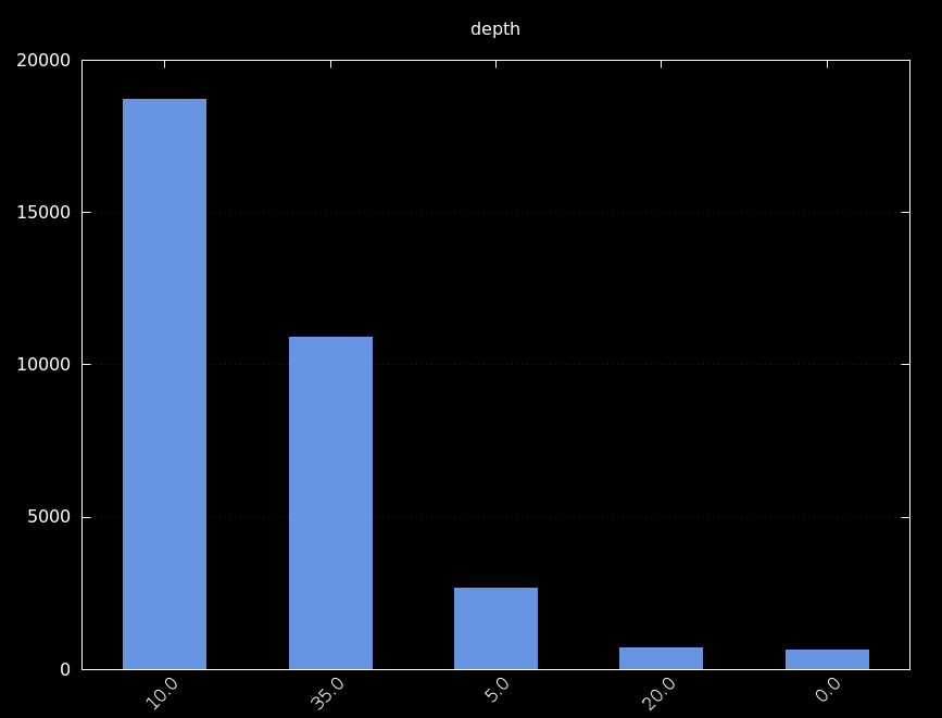
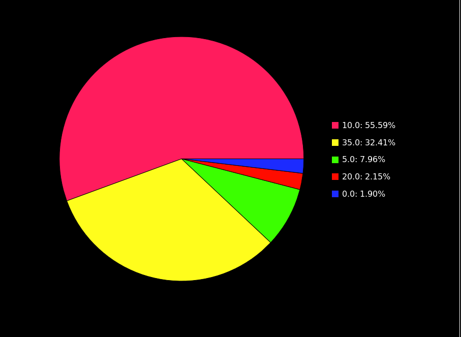
Bar Charts and Pie Charts
Filtergraph’s bar chart and pie chart modes compare the frequency of the different items in a column the user selects from the dataset.
- Sort By
-
The column data that is plotted with the bar chart or pie chart can be changed by using the automatically generated drop-down menu that appears when an axis box is clicked on. Nothing will be plotted until a column is selected. If the column includes numerical data, clicking the filter button bellow the “Sort By” button allow for a range to be specified.
- Groups
-
The number of bars plotted can be specified by changing the default value in “Groups.” The last bar will be labeled as “Other” in the case where less “groups” than distinct data members exist. Where there are an equal number of “groups” to data members, all bars will represent a data member in the selected column. If more “groups” than data members are selected, the maximum number of bars will be plotted.
For pie charts, the value of "Groups" sets the number of slices in the pie chart.
- Labeling and Displays
-
The title for the bar chart or pie chart may be changed with the “Title” box.
The font size not only changes the font size of the title, but also that of the labels for the bar chart or pie chart. This tool can be used to adjust the readability of the labels where overlap occurs.
- Data
-
In bar chart mode, you can use the data button to change the color of the bars. Click on the colored button and use the palette to select a new color.
- Swap Black and White
-
The swap black and white function gives the graph a black background and white text. This can make points on the graph easier to distinguish from the background. The “Swap black and white” box is located below the text formatting section of the portal controls.
- Auto Size
-
The “Auto size” box is located at the bottom of the portal controls box. Auto size automatically resizes the graph window to fit the browser. If auto size is unchecked, you can set the height and width manually.
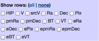
Table
Filtergraph allows you to view your imported dataset in a table format within the portal.
The default number of rows displayed is 100, but this may be changed in the portal controls box.
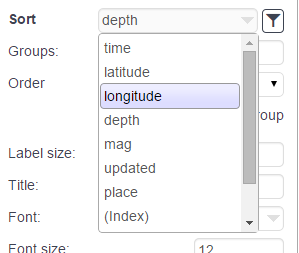
- Sorting
-
A specific column from the dataset may be selected using the automatically generated drop-down menu that appears when the “Sort by:” box is clicked on. This will sort the table by that parameter, smallest to largest numerically or alphabetically from A-Z. Note that you cannot use mathematical functions for this input.
You may also specify a specific range for the selected parameter, and the table will only contain datapoints that fall within that range.
- Show Rows
-
You may distinguish the columns you wish to view by checking their respective boxes under the “Show rows:” section. Only those columns whose boxes you check will be shown in the table. Clicking “all” will show all rows by checking every column box, while clicking “none” will also show all rows by unchecking all of the boxes.
Saving and Sharing
Filtergraph provides a number of ways for you to save and share your data.
Using the Notebook
The notebook is located in the dashboard and in the portal. The notebook in the dashboard shows all of your notebook entries for all of your portals, while the notebook in the portal shows all of your notebook entries for that specific portal.
The purpose of the notebook is to save a copy of your portal, with the desired graph and data settings. The saved entries in your notebook can then be accessed anytime in the future.
To save a portal entry in your notebook, click on the add to notebook button directly below the graph area of the portal.
There are three options associated with each notebook entry. The first is to make the notebook entry public, which makes the notebook entry available to all Filtergraph members by copying the entry onto their notebook. Public notebook entries allow for comments. The second option is to edit the notebook entry. This allows you to change the name of the notebook entry. The third option is to delete the notebook entry.
Links
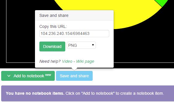
In order to save/share a portal once you have customized and adjusted it, Filtergraph generates a unique URL for your present graph each time you edit it.
Simply click on the “Save and share” button to view and copy this URL. This is a download-free method of saving and sharing a graph or table.
Going to this URL will bring you back to the portal in the exact state it was in when the URL was copied. It may then be further edited and customized and given a new URL.
All graphing modes, scatter plot, histogram and table, generate a URL. This URL is different than the actual portal URL (i.e. filtergraph.com/1311943 instead of filtergraph.com/hipparcos).
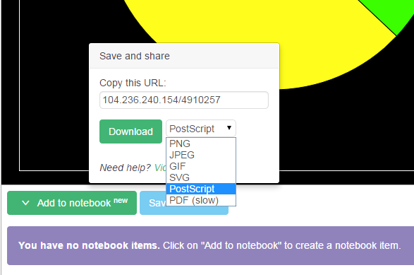
Images
Scatter plots, histograms, pie charts, and bar charts can also be saved as image files.
Simply click on the “Save and share” button to view the download option. Different file formats may be selected using the drop-down menu that appears when the box to the right of the “Download” button is clicked on.
This saves only the graph portion of the page – no part of the portal controls will be shown. This requires you to download the image.
The image may be downloaded as a PNG, JPEG, GIF, SVG, PostScript and PDF.
Text Files
Tables may be saved as text files.
Simply click on the “Save and share” button to view the download option. Different file formats may be selected using the drop-down menu that appears when the box to the right of the “Download” button is clicked on.
The table may be downloaded as first or all rows in HTML, LaTeX and tab, comma and space separated ASCII.
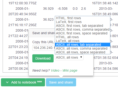
- First Rows vs. All Rows
-
Each format may be downloaded as either “first rows” or “all rows.” Downloading something as “first rows” will only download however many rows are designated in the “Rows:” box. Downloading something as “all rows” will download every row in the dataset that falls within designated parameter ranges, if specified.
- Preserved Sorting
-
All table sorting is preserved when the file is downloaded. The columns and the row order displayed in the table are what will be exported. This makes Filtergraph an effective GUI for quick and easy sorting of large datasets.
Managing a Portal
If you have a portal on Filtergraph, there are a number of options for you to customize your portal.
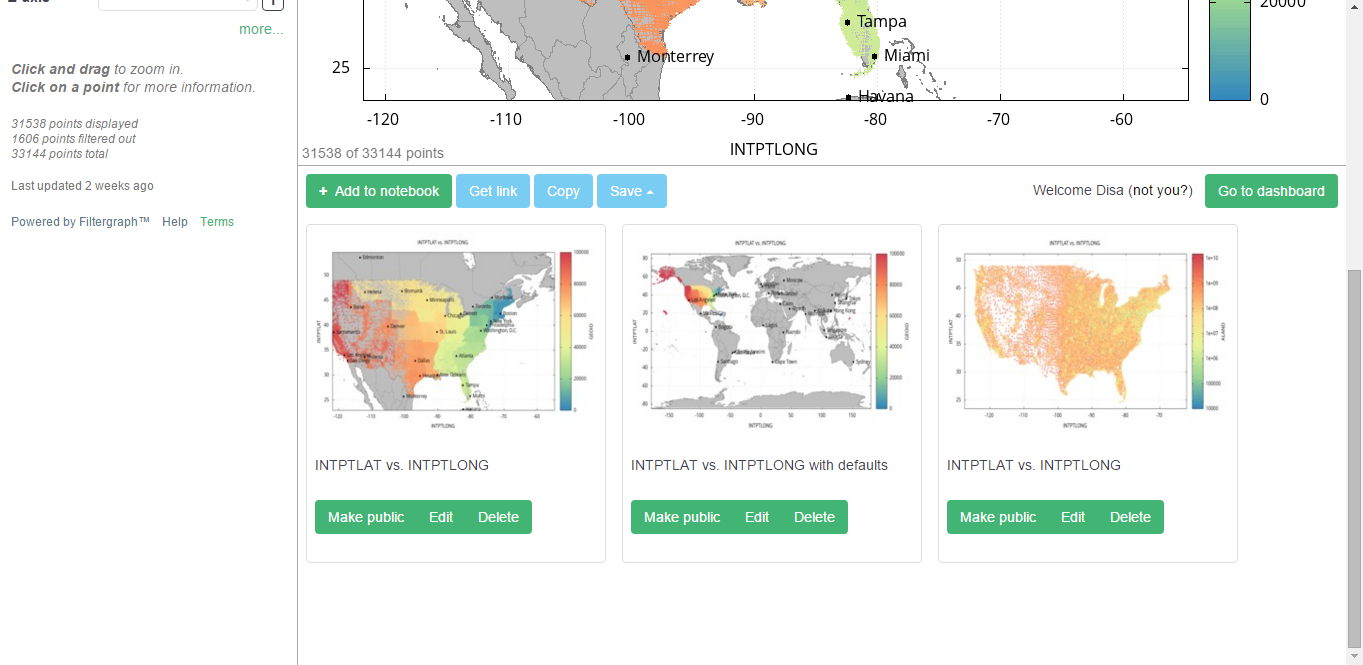
The Dashboard
The dashboard displays immediately after login. Here you will find each portal you have created with a thumbnail of the default plot generated with the data.
If you hover on the thumbnail, you will see two buttons: one with a pair of eyeglasses, which opens the portal, and one with a pencil and paper, which lets you edit the portal. If you have view-only access to a portal, only the eyeglasses button is shown.
Below the list of portals is your notebook. From here, you can manage your notebook entries and view the notebook entries from your portals that other users have made public.
Editing a Portal
Clicking on the pencil and paper icon brings up a page that allows you to edit the portal itself.
-
Manage – allows you to edit the portal name and URL, restrict access to a portal, and delete the entire portal
-
Data files – allows you to manage data files associated with a portal
-
-
Customize – allows you to customize the way the portal displays the dataset outside of the portal; see “Portal customization” for more
-
Replace – allows you to replace the dataset file with another one; essentially the “Delete” and “Upload new file” buttons combined into one. Any header definitions and save and share links are preserved.
-
Delete – deletes the file permanently
-
Add New File – a portal can access more than one dataset at a time; they will not be displayed together on the graphs, but they can be switched between without having to go to another portal
-
-
Users – allows you to manage users who can view and edit a portal
-
-
Set User to View Only – removes edit privileges from a user. To make sure at least one person can edit a portal, you cannot set yourself to view only.
-
Allow User to Edit Portal – grants edit privileges to a user who only has view privileges.
-
Contact via Email – sends an email to the user through your default mail application.
-
Delete – removes all privileges from a user. If the portal is publicly viewable, the user will still be able to view the portal; if you have restricted access to a portal, the user will be blocked. To make sure at least one person can edit a portal, you cannot delete yourself.
-
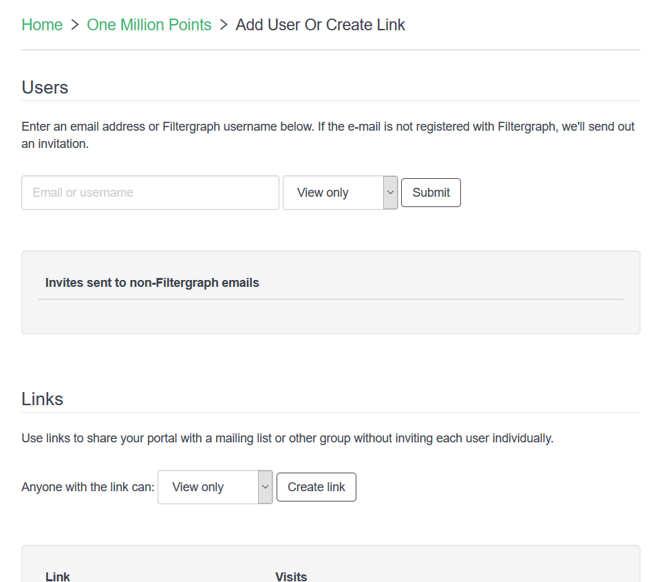
Add User or Create Link – allows you to add a user by email or Filtergraph username, create a link to allow access to a portal, and manage requests to a portal.
-
Send Email to All Users – sends an email to all users of a portal through your default mail application.
-
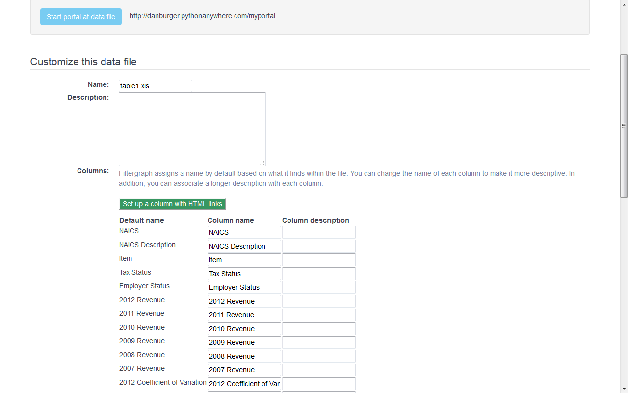
Customizing Your Data File
You can customize how your dataset is displayed in the portal before even going to the portal itself.
The customization page is displayed immediately after creating a new portal and importing a dataset and when you click “Customize” from the portal edit page.
You can rename the file that was just uploaded and give it a description. The name of the file appears when there are multiple files in a portal to choose from. The description will appear on the left hand side of the portal.
The column names can also be changed and given a description. This description will be present in the drop-down menus within the portals and can help make the portal much easier to understand to a user unfamiliar with the data.
From here you can use Filtergraph to generate HTML links for each point in a portal. These HTML links appear in the table view and when a user clicks on a point in a graph. To do this, enter the URL with the name of the field in parentheses, making sure to use the name that was originally given in the data file. For instance:
-
https://www.google.com/search?q=(NAME)will perform a Google search for the value given in a field called NAME within a data file. -
https://www.google.com/maps/@(LAT),(LONG),8zwill open Google Maps at a location given by the fields LAT and LONG within a data file. -
http://finance.yahoo.com/q?s=(TICKER_SYMBOL)will check the stock quote in Yahoo Finance using the ticker symbol given by the field TICKER_SYMBOL within a data file.
To change the settings that appear when a user loads a portal initially, click on "Click here to set initial settings". The portal will load, allowing you to change the initial settings of the portal. Click on "Set the initial settings" to keep them in place. Anyone who visits the portal through the main URL (http://filtergraph.com/yourname) will see the portal through the initial settings you have chosen.
To reset the initial settings, click on the "Reset to defaults" checkbox.
Clicking “Submit” will enter your settings.
Understanding Access Roles
There are three levels of access within Filtergraph.
-
Admins have view and edit privileges to a portal. They can upload, replace and delete files within a portal, customize the portal, set the portal as public or private, and invite other admins and users to the portal. By default, the creator of a portal is the admin. Each portal needs to have at least one admin, Admins cannot revoke or demote access to themselves.
-
Users can view a portal, but they cannot edit it. If the portal is private, users must be invited by an admin in order to view it.
-
Guests are not logged in to Filtergraph and are not required to have Filtergraph accounts. They can visit all public portals. If they have temporary access to a private portal (see below), they can access that portal as well.
Accessing a Private Portal
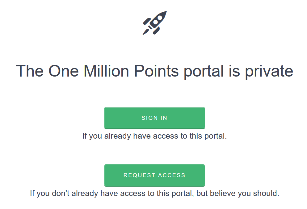
When a user or guest attempts to enter a private portal, one of two things may occur.
-
A user who has access to the private portal can now sign in to access the private portal.
-
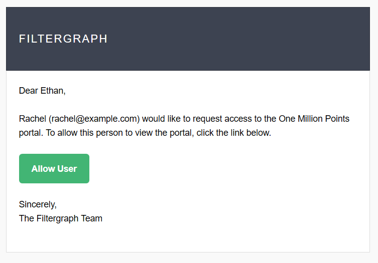
The user or guest doesn’t have access to the private portal. In this case, he or she may request access with a click of a button, which will send an email to all the administrators of the portal. The portal administrators can then approve the access request (see below).
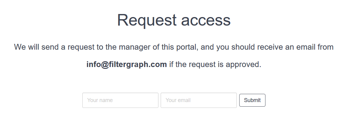
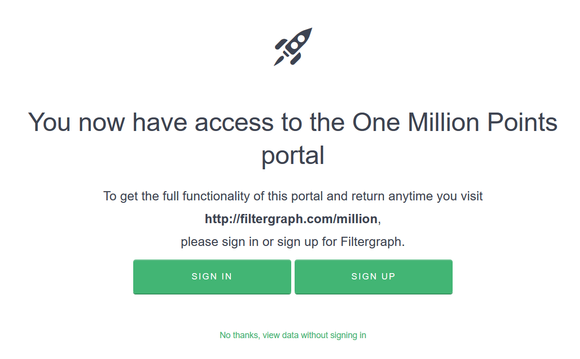
If an access request is approved, the user or guest will be given a link to access to the portal. When the user or guest clicks on the access link, several cases can occur.
-
For existing registered users, if the access link gives viewing and editing privileges, then the user will get edit privileges as well and become an admin.
-
For all other registered users, the access link will give the user access to the portal.
-
Guests will have the option to sign in or sign up for a Filtergraph account to receive full functionality and permanent access to the portal, or click on "No thanks, view without signing in" to receive temporary access to the portal for as long as the browser's cookie settings allow.
Granting Access to a Portal
There are three ways you can grant access to your portal to guests and users.
- Access requests
-
When a user or guest requests access to a private portal, all of the admins will receive an email with a link to allow the user or guest to access the portal. When one of the admins grants access, several cases can occur.
-
If the request comes from a registered user, or it comes from a guest who later registers for Filtergraph, he or she will be given access to the portal right away and notified by email.
-
If the request comes from a guest, he or she will receive a link to access the portal. The guest can either sign in or sign up for Filtergraph to receive full functionality and permanent access to the portal, or click on "No thanks, view without signing in" to receive temporary access to the portal.
-
- Adding a user manually
-
An admin of a private portal may add other users or admins to a portal. To add a user, the administrator should click on the "Add User or Create Link" button in the edit page of the portal. Several cases are possible:
-
If the username or email is already associated with a Filtergraph account, that user or admin will be granted access and notified by email.
-
If the user already had view-only access to the private portal but the admin wants to give the user editing privileges, then the admin can select the "view and edit" option when adding the user. The user will then be given editing privileges, becoming an admin. He or she will receive an email.
-
If the email is not associated with a Filtergraph account, then the guest will receive an email with an invite link to the portal. When the guest clicks on the "accept this invitation" option in the email, he or she will be given the choice to sign in or sign up for Filtergraph to receive full functionality and permanent access to the portal, or click on "No thanks, view without signing in" to receive temporary access to the portal for as long as the browser's cookie settings allow.
-
- Special links
-
From the “Add User or Create Link” page, an administrator of a private portal may create an access link to the private portal. These are useful for sharing data with mailing lists or other groups. The admin can choose whether the access link will provide view only access or view and edit access to the private portal. Once the admin creates the link, the link is added to the Filtergraph database, and can be viewed by the admin in the table on the same page. The link can now be shared with anyone, and anyone with the link can access the private portal.
An administrator of a private portal may revoke an access link to the private portal. Clicking on the "revoke link" button in the table displaying all of the access links will revoke the access link. Once the link is revoked, it will become invalid, and anyone attempting to gain access to the portal through the access link will be denied access. In addition, anyone who had temporary access through the link will be blocked from the portal.
Temporary Access
Temporary access is useful if you want to share a portal with a guest without requiring the guest to register for a Filtergraph account.
If a guest chooses the option of "No thanks, view data without signing in", he or she will get temporary access to the portal for as long as the browser's cookie settings allow.
While the guest is able to access the data, he or she will be unable to store data in the notebook for long-term use, respond to notebook entries, or access the portal through its main URL. If the guest later chooses to log into Filtergraph or register for a Filtergraph account, the user will now have permanent access to the private portal.
All temporary access is cleared if the access link is revoked or if the guest signs in and out of Filtergraph without visiting the portal.